

KEY TAKEAWAYS:
- There’s no reason for your contracts to be dry and boring documents that are completely disconnected from the rest of your brand identity.
- You don’t need to be a graphic designer to make use of effective visual design principles to take your contracts to the next level.
- Learn how to use the principles of hierarchy, alignment, repetition, contrast, and balance for the best results.

Visual design principles help frame what makes a good design, which can just as well be applied to contracts. After all, they are just like any other document or print material that exists in the graphic design world.
Creating a contract with design thinking leads to more impactful and clearer contracts. So how can you apply design principles to design better contracts?
The good news is that you can absolutely design better contract drafting experiences using Microsoft Word, with just a few techniques.
Design Principle #1: Hierarchy
Hierarchy guides the reader as to what they should look at first, second, and so on. In other words, a strong hierarchy system can guide the order of consumption of information and drive its importance.
In a contract context, good hierarchy would usually take the following order:
- Document title – what are we looking at?
- Party introduction – who’s involved in the agreement?
- Main document clauses, with headings to identify each section’s topic.
- The signature page, which all signing parties will see.
A robust hierarchy structure can serve as the backbone of a contract’s design, as it gives the reader clear guidance on what to read in what order.
An easy way to achieve this is by leveraging contrast between the different sections of your contract. That is playing with font sizes in such a way that easily grabs attention. For example, the font size of the document title should be much bigger than the rest of the document to stand out.
Design Principle #2: Alignment
Alignment brings families of content together and brings cohesion to your contract’s overall design by grouping similar information together.
In a contract, alignment doesn’t mean simply aligning everything to one side of a contract. Rather, consider grouping content together in a cohesive manner on the page, such as clause names.
For example, the way you read a contract should easily flow from left to right, top to bottom and your clause names being aligned on the left.
Design Principle #3: Repetition
Repetition works alongside alignment in the sense that you’ll give your document some instantly recognisable patterns, making it easier for the human eye to follow.
In a contract, you’ll typically use a particular font for headings and other focus items such as clause names. You may use another font size and style for another type of information (the content of the clause) and consistently repeat that.
Design Principle #4: Contrast
Contrast allows you to create distinctions between different types of information. In the context of contracts, for example, you’d benefit from distinguishing between the clause and the rest of the content.
You can successfully apply this principle with different families of fonts (a serif and a sans serif, for instance) or even a certain style (bold versus regular type) to distinguish between two sets of information.
Design Principle #5: Balance
Good design should not feel overwhelming or confusing. Yes, use different fonts and colours. But when you use too many, the document can become too chaotic to follow comfortably.
For example, try not to overwhelm the document by condensing your content to reduce the page count. This may significantly impair your reader’s ability to take in all of the information you’re presenting.
Learn More: Design Matters: Revamping Contracts for Impact and Clarity by Sarah Ouis.
Underrated Hack: Incorporate Your Brand Guidelines in Your Contracts
Ask your marketing or design team for your company’s brand guidelines, a document that embodies the mission, values, look, and feel of your organisation. A thorough brand guidelines document includes all sorts of guidance for design elements such as the colour palette composition, which fonts to use in what context, the tone of voice, and so on.
For example, if you think of IKEA, blue and yellow probably come to mind, along with a family feel or geometrical shapes. The stronger these associations, the stronger your brand.
Making your contract “on brand” can go a long way towards demonstrating the legal team’s support of your company’s mission, growing the strength of your brand, and creating that sense of belonging and instant recognition.
It’s always a missed opportunity when contracting with “cool brands” only to get slapped in the face with a cold and dry contract document that feels so disconnected from what they portray on social media or TV.
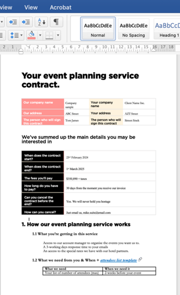
Example Contract Design
Below you can see a quick example of a one-page dummy event planning contract I put together simply using tables, font pairing, and the design principles mentioned in this article. You’ll soon realise that it’s actually easy to start incorporating these principles without being a full-on graphic designer.
Follow @SarahOuis on LinkedIn and get in touch with her for help with contract design or LinkedIn content creation for legal professionals.


4 Responses
I was excited about the design principles until I saw the example contract of those principles in action… ????????
What were you looking for that you did not see in the example?
I wonder if drafting contracts like the one in the example would come across as unprofessional
Hello! I think when this concept is used in consumer-facing terms and conditions, it is a really nice way to reduce the formality while also helping them understand the legalese. If used in a corporate setting, you may want it to look more formal but you can still apply a lot of these concepts.